Learning Objectives
Following this assignment students should be able to:
- Describe the distribution of a variable
- Summarize the distribution of categorical/discrete variables
- Summarize the distribution of continuous variables
- Call and use Stata’s stored results
- Construct graphs of distributions of single variables
- Construct theoretical distributions
- Conduct a hypothesis test adn evaluate the results
Reading
Topics
- The distribution of a variable
- Summarizing the distribution
- Plotting the distribution
- Creating theoretical distributions
- Testing hypotheses
Readings
- Reading (chapter 3): The Effect
- Reading: Stata Tables
- Video (6 min): Types of data and variables
Lecture Notes
- Understanding and Summarizing Distributions of Variables
- Graphing Distributions
- Creating Theoretical Distributions
Exercises
-
Tabulate Data (10 pts)
Load the Stata system dataset
nlsw88.dta:* load national longitudinal survey of young women sysuse nlsw88, clear1. Use
tabto produce a frequency table for the variablerace.- What are the number of observations in each race category?
- Which race category is the mode (most common)?
- What is the percentage of women in each category?
2. Use
tabagain, this time on the variableunion, but include missing values in the table using themissingoption:- How many women are in a union, how many are not, and how many are missing?
- What percent of the sample has missing values for
union?
-
Summarize Data (10 pts)
Using the
nlsw88data,- Use
sumto summarize the variablewage.- What is the mean wage?
- What is the standard deviation?
- What are the minimum and maximum values?
- Use the
detailoption withsum.- What is the median (50th percentile) wage?
- What are wages at the 25th and 75th percentile?
- Restrict the summary to women who are college graduates using
if.- Is the mean wage for college graduates higher or lower than the overall mean?
- Is the standard deviation for college graduates larger or smaller than in the full sample?
- Use
-
Use Stored Values (10 pts)
Using the
nlsw88data,-
Using Stata’s stored results, what is the range of
hours? -
Using the stored percentiles, what is the interquartile range (IQR) of
hours?
-
-
Histograms (10 pts)
Using the
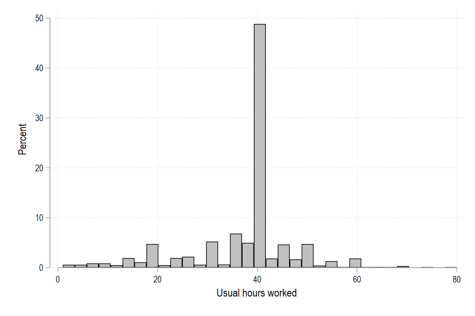
nlsw88data,1. Draw a histogram of hours worked per week, with the percent of workers on the y-axis.
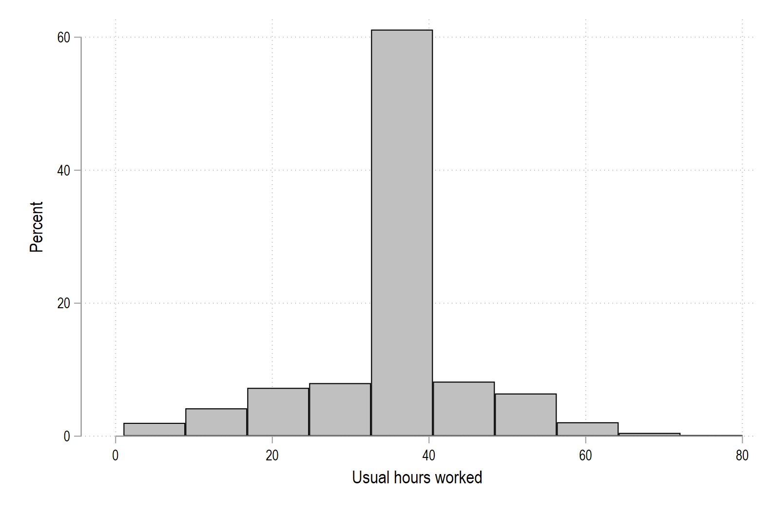
2. Draw a histogram of
hourswith 10 bins.3. Draw a histogram of
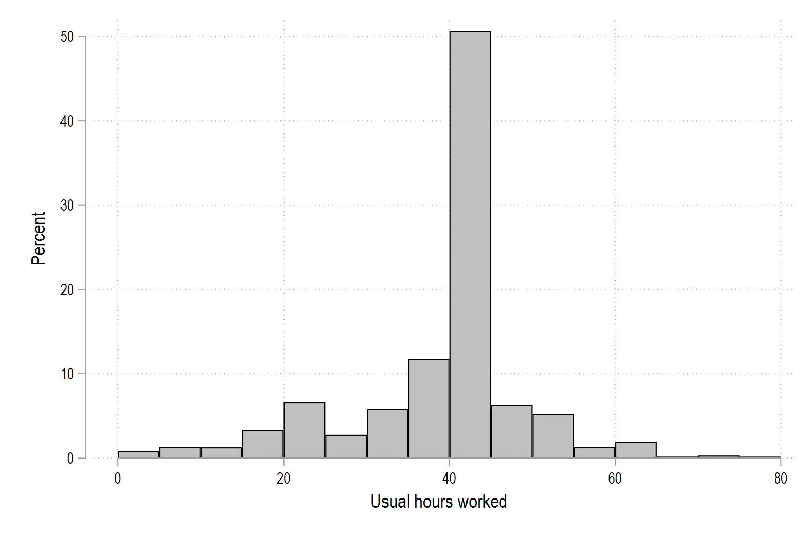
hourscontrolling the bin width directly starting the first bin at 0 and having bins of width 5.The variable
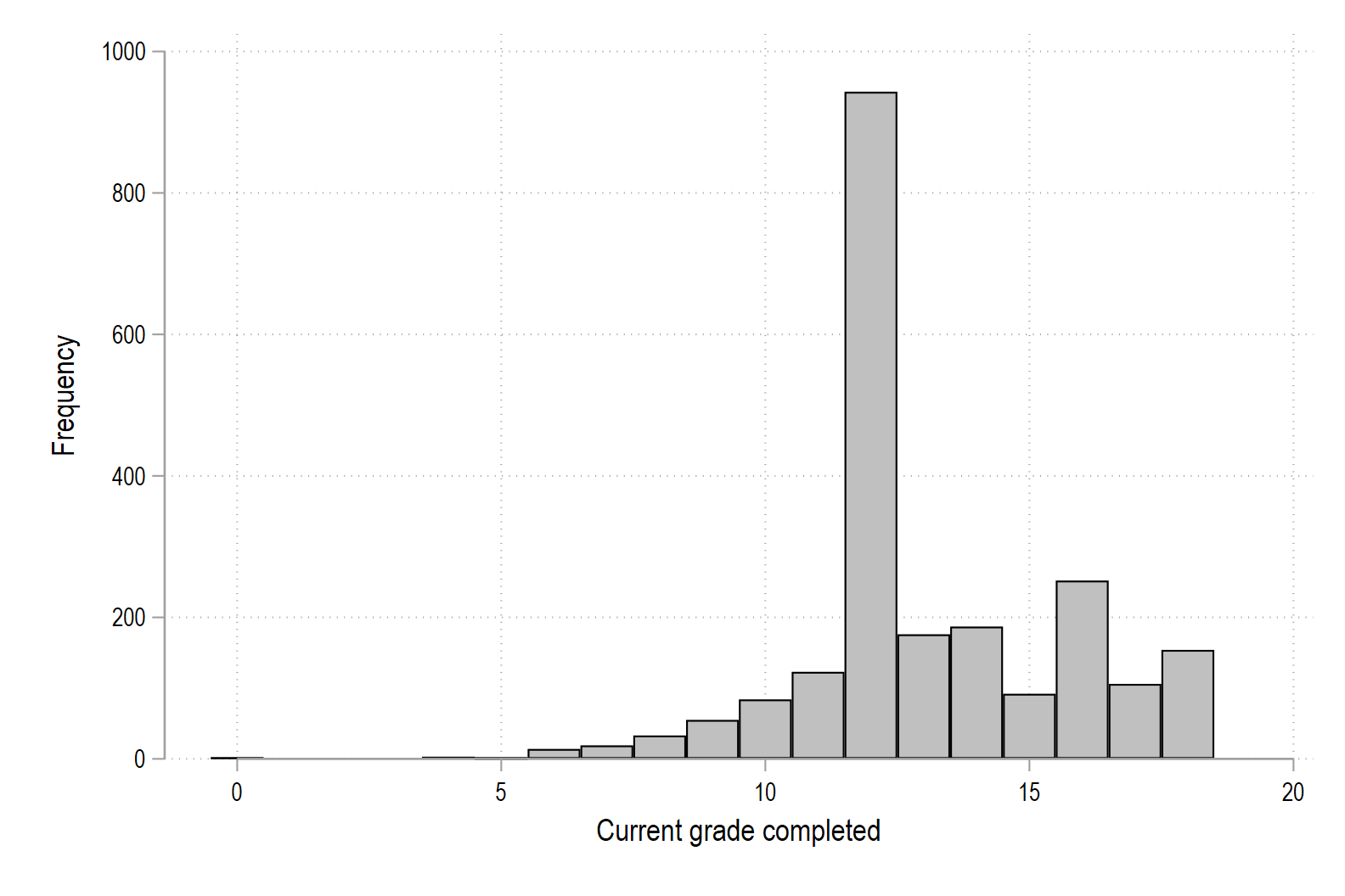
graderecords completed years of education and takes on integer values, meaning it is a discrete variable. In this case, Stata will make better looking historgrams if you tell Stata that the variable is discrete.Start by graphing
gradeusing just thehistcommand.4. Draw a histogram of
gradeusing thediscreteoption along with frequency.
-
Density Functions (10 pts)
Using the
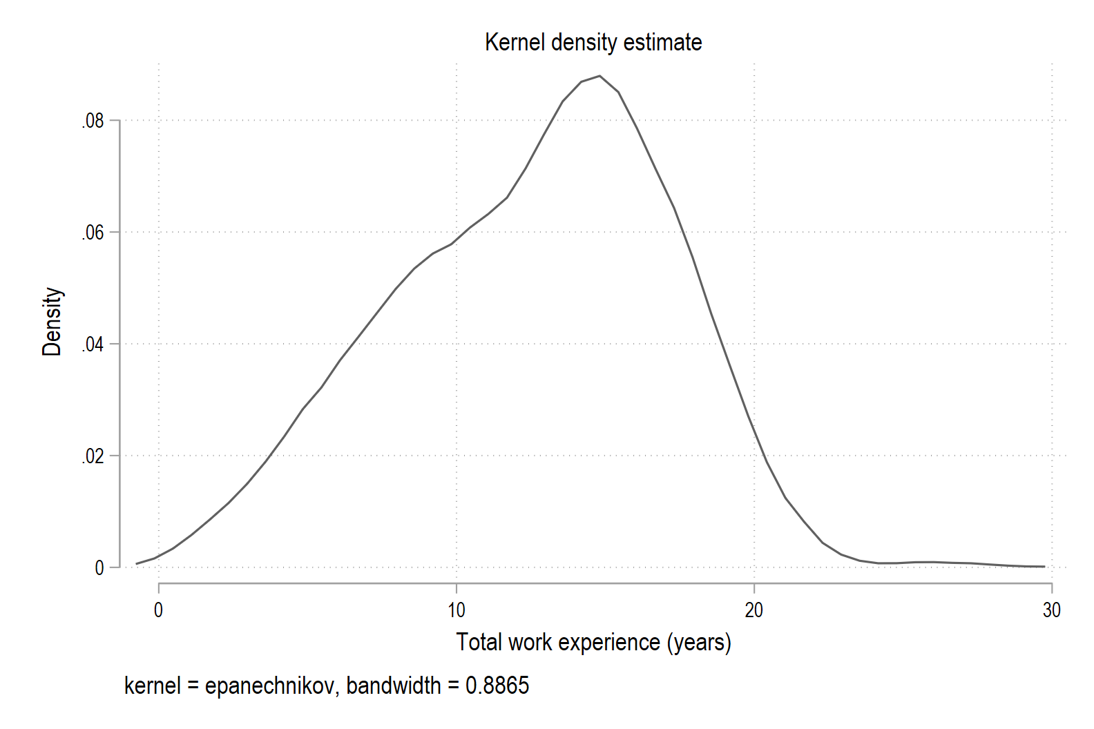
nlsw88data,1. Draw a kernel density of total work experience.
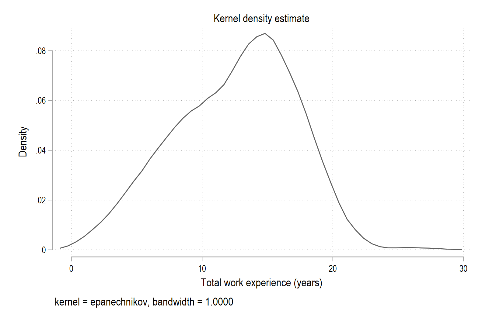
2. Draw a version with less smoothing.
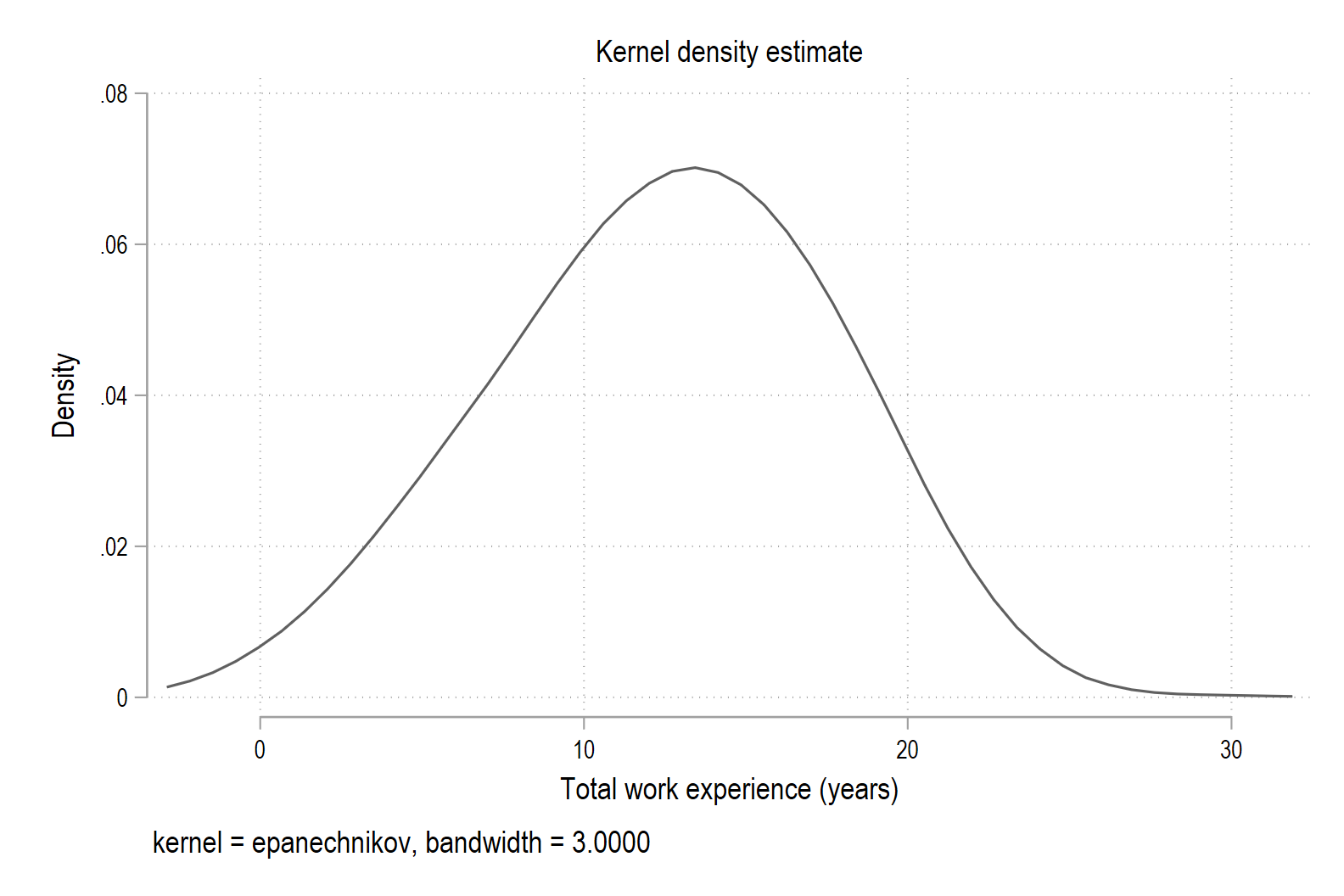
3. Draw a version with more smoothing.
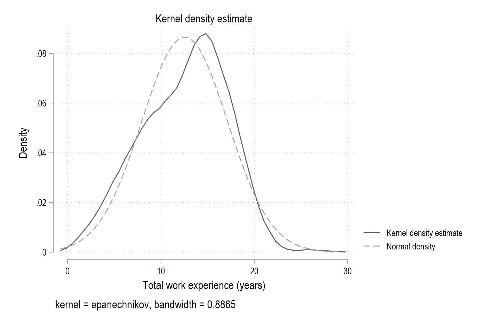
Stata can overlay a normal density curve with the same mean and variance as your data on top of the kernel density estimate. This lets you visually compare your distribution to a smooth, bell-shaped curve (we are not doing formal hypothesis tests here).
4. Draw a kernel density of
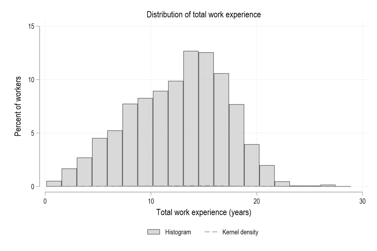
ttl_expusing thenormaloption.5. Finally, we will put it all together by drawing a histogram and a kernel density for
ttl_expon the same plot and make the graph presentation-quality.- First, choose reasonable binning (20) for
ttl_expand draw a histogram with percent on the y-axis: - Next create a combined graph with both the histogram and the kernel density. Use
twowayto overlay them: - Modify the graph by adding the
color(%60)option, which makes the bars lighter (60% of full opacity) so the density line stands out. - Change the
title()of the graph to be “Distribution of total work experience” - Change the x-axis title to “Total work experience (years)” and the y-axis title to “Percent of workers”
- Finally, create a legend and place it below the graph (
pos) and in two columns (col). Label the shaded area using1 "Histogram"and the line using2 "Kernel density".
- First, choose reasonable binning (20) for
-
Random Numbers (10 pts)
Using the
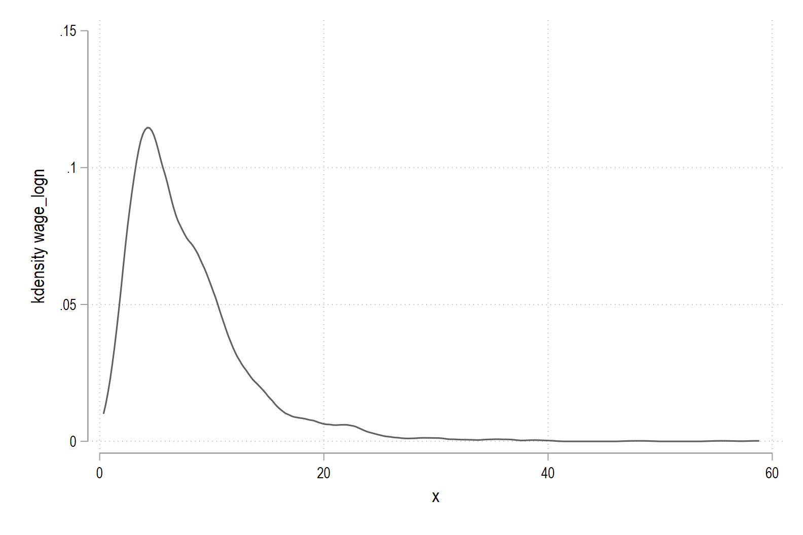
nlsw88data,1. Simulate and then graph a theoretical log-normal distribution.
- Start by setting the seed to the same seed that we set when we simulated a normal distribution for
ttl_exp. - Next, create a variable called
wage_normthat has a normal distribution with mean 1.831 and standard deviation of 0.6615. - To make a log-normal distribution, we need to exponentiate
wage_normusing Stata’s built in math functionexp(). Call this new variablewage_logn. - Finally, draw the distribution of this new variable using
kdensity.
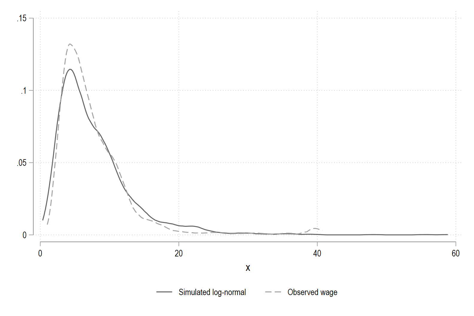
2. Graph
wageand the log-normal distribution on same graph.- Give the graph a descriptive title as well as labelling the x-axis and y-axis.
- Create a legend and place it below the graph (
pos) and in two columns (col). - Label the two lines as “Simulated log-normal” and “Observed wage”.
- Start by setting the seed to the same seed that we set when we simulated a normal distribution for
-
Percentiles (10 pts)
Using the
nlsw88data,1. Use
sum, detailto get detailed summary statistics forwage. Store the value of the 5th and 95th percentile aslocalscalledp5andp95. Finally, tell stata todisplaytwo lines of text, followed by the actual value of the 5th and 95th using the values stored inp5andp95:- 5th percentile of wage:
- 95th percentile of wage:
When we use
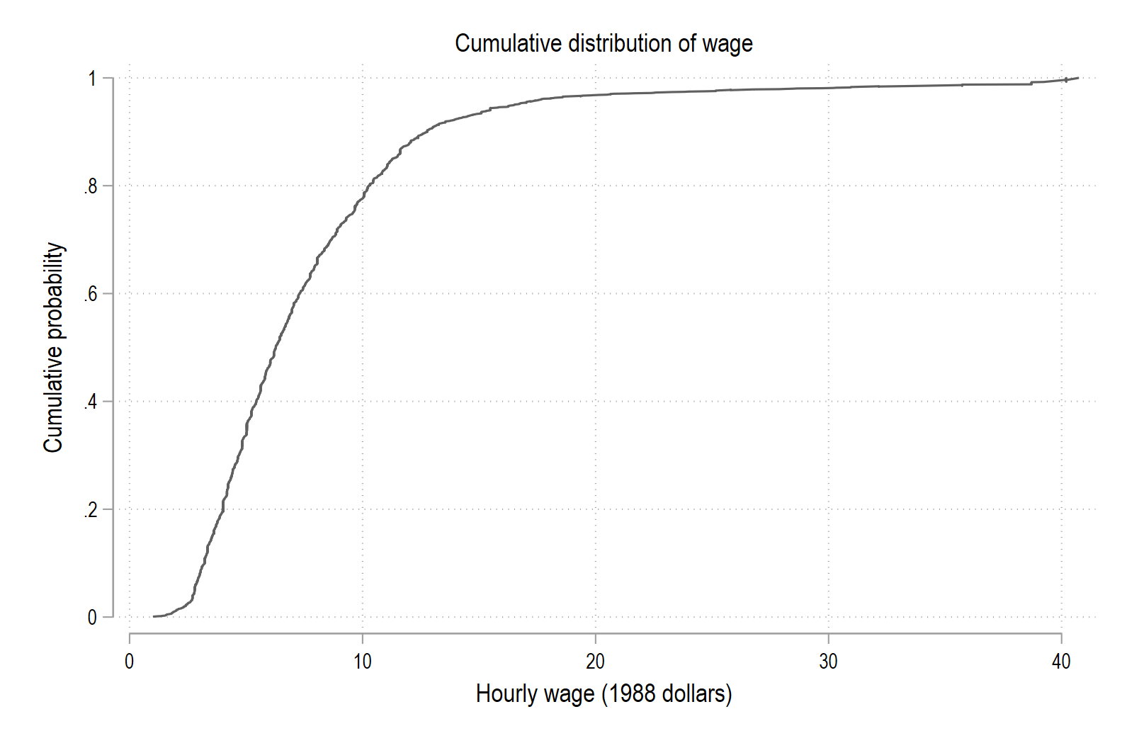
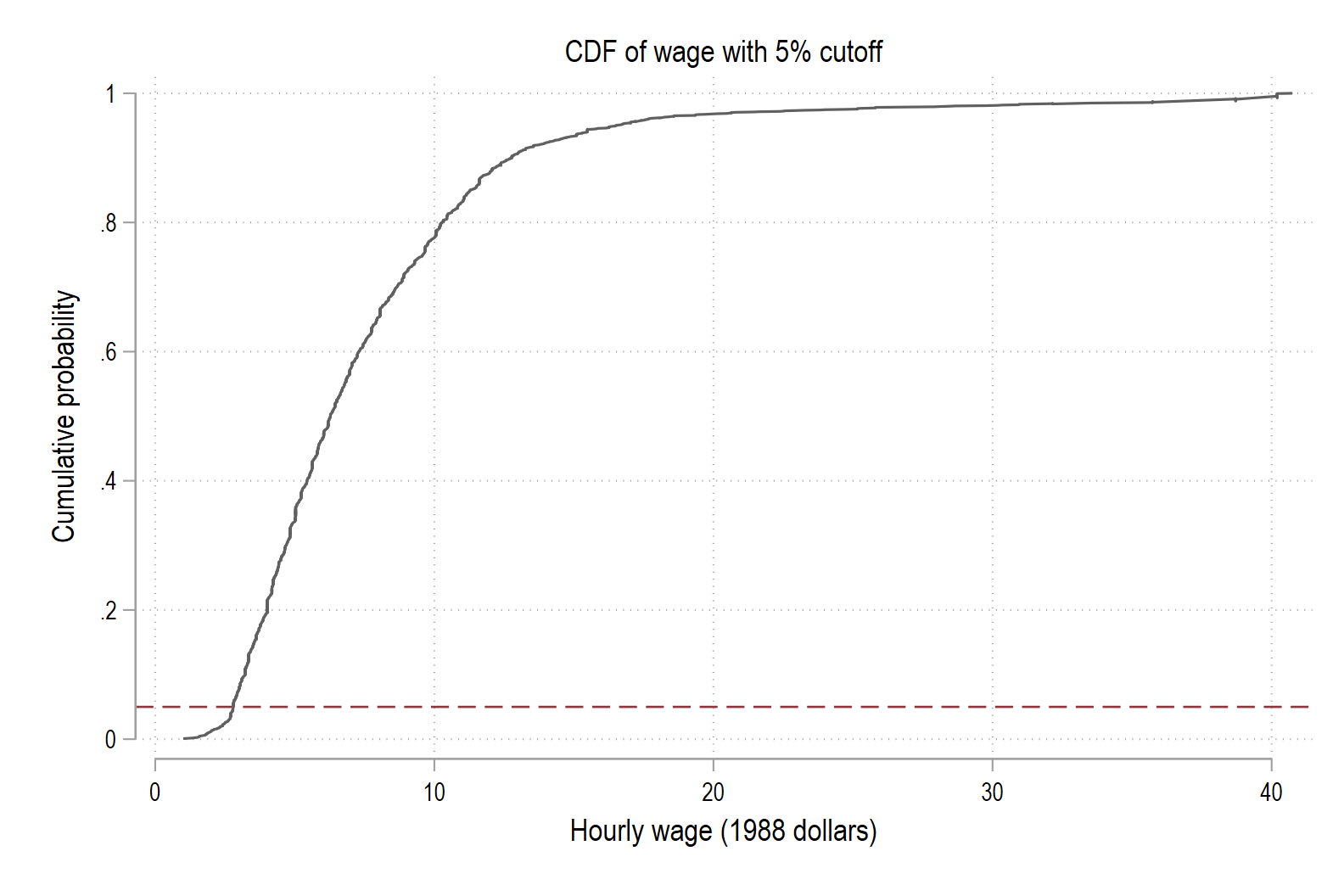
kdensitywe are drawing the probability density function (PDF). Sometimes it’s convenient to work with the cumulative distribution function (CDF) rather than the density. The CDF shows, for each wage value, the fraction of workers with wage less than or equal to that value.2. Use the
cumulcommand to create the empirical CDF of wage:cumul wage, gen(F_wage). Then draw the CDF using the commandtwoway line. Note that this is our first time graphing more than one variable. You will need to includeF_wageand thenwage. You will also need to use the optionsortto get the smooth CDF that we are looking for.- Title the graph “Cumulative distribution of wage”
- Title the x-axis “Hourly wage (1988 dollars)”
- Title the y-axis “Cumulative probability”
3. Now we will add a line to the graph at 5% (0.05 on the y-axis) to mark the 5th percentile using
yline. Recall in the lecture we added vertical lines usingxline.- Give the line a
dashpattern - Color the line
maroon - Title this new graph “CDF of wage with 5% cutoff”
-
Hypothesis Testing (20 pts)
Using the
nlsw88data, this exercise asks you to apply the five-step hypothesis testing procedure from the Creating Theoretical Distributions lecture:Test whether women work 40 hours per week on average. The variable
hoursrecords usual hours worked per week.- Use
sumto find the sample mean, standard deviation, and sample size. - As a comment in your do-file, write down the hypotheses for testing whether women work 40 hours per week on average:
- $H_0: \mu = 40$
- $H_1: \mu \neq 40$
1. Use
ttestto perform a one-sample t-test of this hypothesis.- What is the sample mean of
hours? - What is the t-statistic?
- How many degrees of freedom are there?
- What is the two-sided p-value?
- At the 5% significance level, do you reject or fail to reject the null hypothesis that women work 40 hours per week on average?
Now we will test a hypothesis about the mean hourly
wagefor college graduates only.- Use
tabwith and without thenolaboption to determine which numerical value college grade takes. - Use
sumwithifto summarize the wages of just college graduates. - Suppose someone claims that college graduates in this sample earn $10 per hour on average. Set up the hypotheses:
- $H_0: \mu = 10$
- $H_1: \mu \neq 10$
2. Use a one-sample t-test restricted to college graduates to test this claim.
- What is the sample mean of
hours? - What is the t-statistic?
- How many degrees of freedom are there?
- What is the two-sided p-value?
- At the 5% significance level, what is your decision about $H_0$?
- Use
-
Check That Your Code Runs (10 pts)
Sometimes you think you’re code runs, but it only actually works because of something else you did previously. To make sure it actually runs you should save your work and then run it in a clean environment.
Follow these steps in to make sure your code really runs:
-
Restart Stata by closing the instance of Stata that you have open.
-
When you reopen Stata, type in the command line
clear all. Or, better yet, putclear allat the top of your.dofile, after the preamble but before any commands. -
Rerun your entire homework assignment by clicking the
Executebutton to make sure it runs from start to finish and produces the expected results. -
Make sure that you saved your code with the name of the assignment number (i.e.,
assignment_01). You should see the file in your git repo on your machine. -
Make sure that your code will run on other computers (relevant for all assignments after the first assignment)
- No
cd. Use aproject.dofile instead to set directories - Use only relative paths in files other than the
project.dofile - Use
/not\for paths
- No
-
-
Challenge 4 (Challenge - 20 pts)
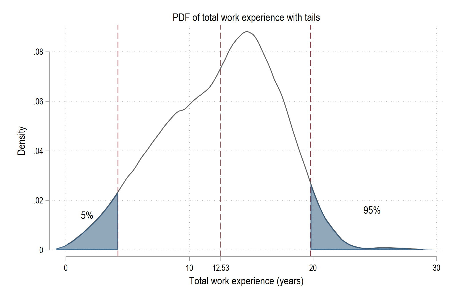
In this challenge exercise you will recreate the “PDF of total work experience with tails” graph from lecture.
You will:
- Compute the kernel density of
ttl_exp, - Shade the bottom 5% and top 5% of the distribution,
- Mark the 5th percentile, mean, and 95th percentile with vertical lines,
- Label the tails with “5%” and “95%”, and
- Print the mean value below the x-axis.
Work in a do-file, and include comments so you can remember what you did when you come back later.
1. Load the data and get key summary stats
-
Load the data:
* load data sysuse nlsw88, clear -
Get detailed summary statistics for
ttl_exp:* get summary stats from ttl_exp quietly sum ttl_exp, detail -
Store the mean, 5th percentile, and 95th percentile in locals:
 * store values as locals
     local           mu  = r(mean)
     local           p5  = r(p5)
     local           p95 = r(p95)
Check in the Results window that these values look reasonable for total work experience.
2. Compute the kernel density and define tail regions
-
Ask Stata to compute the kernel density of
ttl_expand save the grid and density in new variables:* compute kernel density and save the grid + density kdensity ttl_exp, gen(x_ttl d_ttl) nographx_ttlcontains the x-values for the density grid.d_ttlcontains the estimated density at each x-value.
-
Create variables for the left and right tails:
* create left and right tail densities for shading gen d_left = d_ttl if x_ttl <= `p5' gen d_right = d_ttl if x_ttl >= `p95'd_leftwill be nonmissing only in the bottom 5% region.d_rightwill be nonmissing only in the top 5% region.
3. Find the cutoffs for shading and add a zero line
-
Find the maximum x-value in the left tail and the minimum x-value in the right tail. These will be used for vertical lines:
* create locals for right and left cutoff quietly sum x_ttl if !missing(d_left), meanonly local lcut = r(max) quietly sum x_ttl if !missing(d_right), meanonly local rcut = r(min) -
Create a variable of zeros for use with
rarea(which shades between two curves):* a zero line for rarea (needed for shading) gen zero = 0 -
Create nicely formatted labels for the 5th percentile, mean, and 95th percentile if you want to use them later:
 * create nicely formatted labels for tick marks
     local           p5lbl  : display %5.2f `p5'
     local           mulbl  : display %5.2f `mu'
     local           p95lbl : display %5.2f `p95'
4. Choose positions for the “5%” and “95%” labels
You want the text “5%” and “95%” to appear inside the shaded tail regions.
-
Compute the x-position for the center of the left tail and a y-position that is 60% of the maximum density in the left tail:
* left tail center & height quietly sum x_ttl if !missing(d_left), meanonly local lx = (r(min) + r(max))/2 quietly sum d_ttl if !missing(d_left), meanonly local ly = 0.6*r(max) -
Do the same for the right tail:
 * right tail center & height
     quietly sum     x_ttl if !missing(d_right), meanonly
     local           rx = (r(min) + r(max))/2

     quietly sum     d_ttl if !missing(d_right), meanonly
     local           ry = 0.6*r(max)
These locals (
lx,ly,rx,ry) will give Stata the coordinates for the text labels.
5. Draw the final graph
Now put everything together in a single
twowaycommand. Type (or paste) the following into your do-file:* final graph twoway (kdensity ttl_exp) /// (rarea d_left zero x_ttl, sort c(navy%60)) /// (rarea d_right zero x_ttl, sort c(navy%60)), /// xline(`lcut' `mu' `rcut', lp(dash) lc(maroon)) /// xlabel(`mu' "`mulbl'", add) /// text(`ly' `lx' "5%", place(c)) /// text(`ry' `rx' "95%", place(c)) /// title("PDF of total work experience") /// xtitle("Total work experience (years)") /// ytitle("Density") /// legend(off)This should produce a graph with:
- The kernel density of
ttl_expin black, - The bottom 5% and top 5% shaded in navy,
- Vertical dashed lines at the 5th percentile, mean, and 95th percentile,
- The labels “5%” and “95%” inside the shaded regions, and
- The numeric value of the mean printed below the x-axis at its location.
- Compute the kernel density of
Assignment submission checklist
Solutions
- Tabulate Data
- Summarize Data
- Use Stored Values
- Histograms 1, 2, 3, 4
- Density Functions 1, 2, 3, 4, 5
- Random Numbers 1, 2
- Percentiles 1, 2, 3
- Hypothesis Testing
- Check That Your Code Runs
- Challenge 4