Learning Objectives
Following this assignment students should be able to:
- Create a scatter plot of two variables
- Write code to manipulate how the plot looks
- Describe the relationship between two variables
- Represent condition distributions and conditional means
- Fit a line to data
- Evaluate the relationship between two variables
Reading
Topics
- Scatter plots
- Beautifying plots
- Conditional distributions
- Line fitting
Readings
- Reading (chapter 4): The Effect
- Reading: Stata Graphics
Lecture Notes
Exercises
-
Basic Scatter Plots (10 pts)
Using the
eth_allrounds_finaldata,-
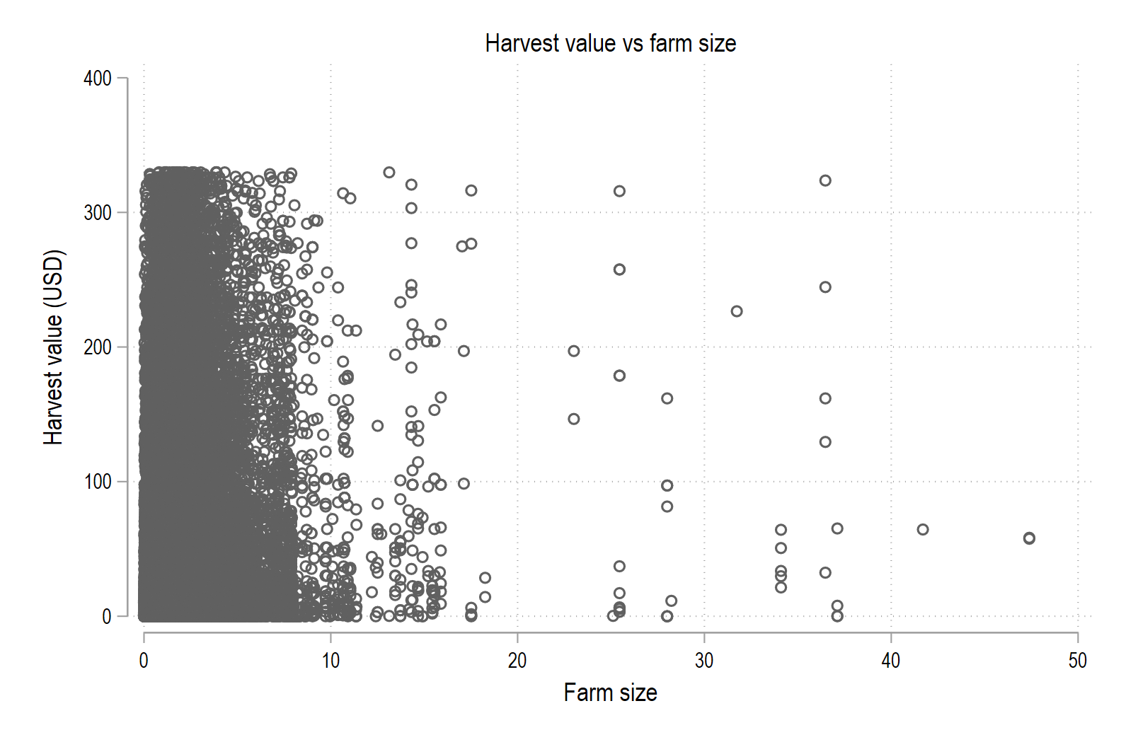
Make a scatter plot of harvest value (
harvest_value_USD) versus farm size (farm_size), with harvest value on the y-axis. Include informative labels and a title. -
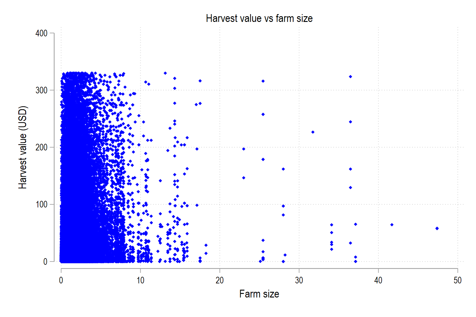
Change the appearance of the markers in the graph to be
tinybluediamonds.
-
-
Grouped Scatter Plots (20 pts)
Using the
eth_allrounds_finaldata,-
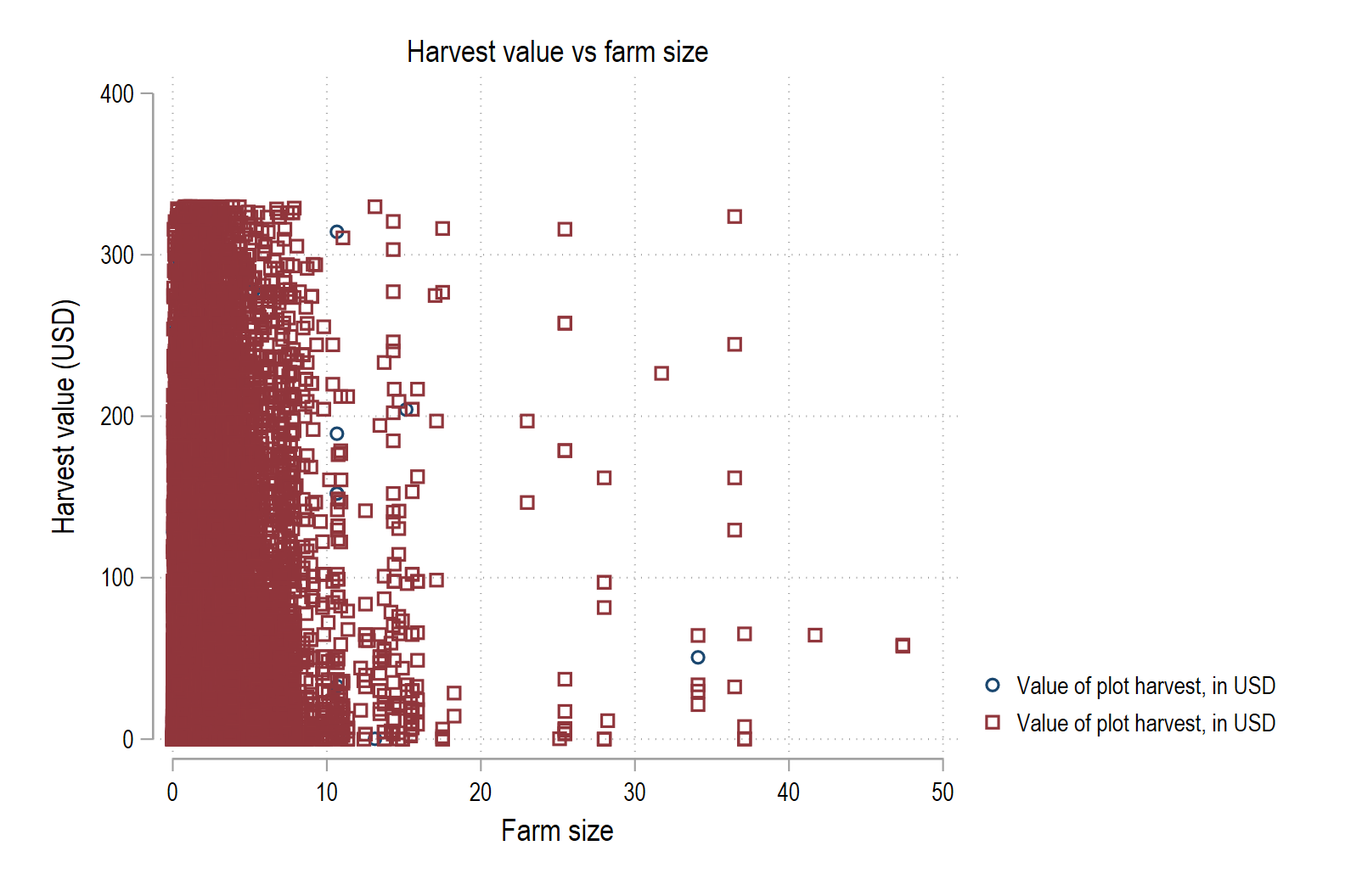
Make a scatter plot of harvest value versus farm size by irrigation status (
irrigated) on a single scatter plot. Include informative labels and a title. Color irrigated plotsnavyand rainfed plotsmaroon -
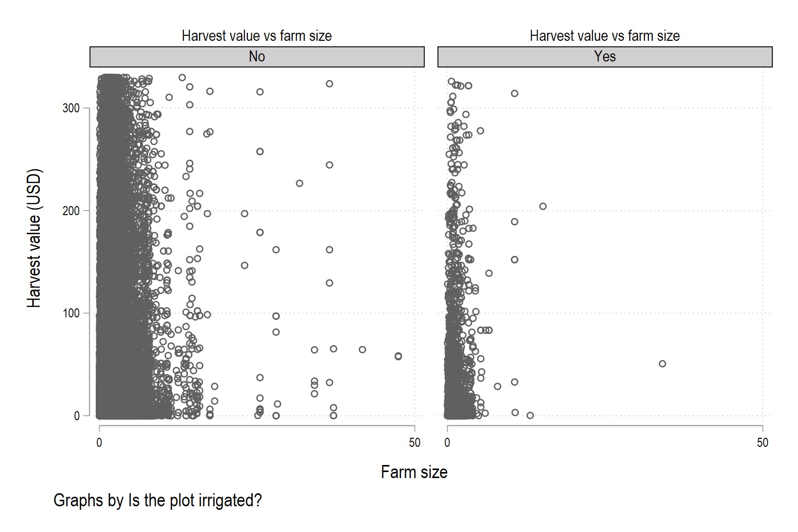
Make a scatter plot of harvest value versus farm size by irrigation status use the
by(irrigated)option onscatterto make separate panels for irrigated and rainfed plots. -
Which makes it easier to compare irrigated and rainfed plots? Which makes it easier to see the overall relationship between farm size and harvest value?
-
-
Conditional Distributions (10 pts)
Using the
eth_allrounds_finaldata, explore how the distribution of an input varies across groups.Start by using
sum, detailto summarizetotal_hired_labor_daysseparately for:- Plots with improved seed (
improved == 1), and - Plots without improved seed (
improved == 0).
-
Is the average number of hired labor days greater when a plot is planted with improved seed or without improved seed?
-
Draw two kernel density plots, one for each group, on the same graph using
ifconditions. Is this graph informative? Why or why not?
- Plots with improved seed (
-
Conditional Means (Discrete) (10 pts)
Using the
eth_allrounds_finaldata, look at mean outcomes by group for a discrete variable.-
Compute mean harvest quantity (
harvest_kg) by plot ownership (plot_owned) usingtabstat. Which group has the higher mean yield? -
Make a
graph barof the mean harvest value (harvest_value_USD) by crop tpye (main_crop). Which crop has the highest average value and what is that value?
-
-
Conditional Means (Continuous) (10 pts)
Using the
eth_allrounds_finaldata, now consider how an outcome varies with a continuous household-level variable by binning it.-
Use
xtileto create quartiles (asset_q) of household asset index (hh_asset_index). Label the variable as “Asset Quartiles”. For each asset quartile, usebysandsumto compute the mean harvest value (harvest_value_USD). Which quartile has the higest mean value of harvest? -
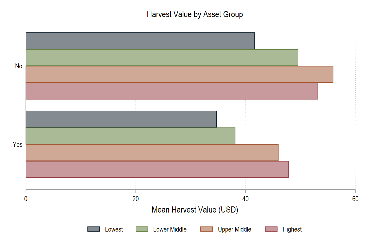
Make a bar graph using
hbarshowing the mean harvest value (harvest_value_USD)overboth asset quartile (asset_q) andoverif the household experienced a shock to their crops (crop_shock).- Add an informative title and axis label.
- Tell Stata to treat the categories as if the first category are variables on y-axis (
asyvar). This will allow us to change the color of each bar. - Set the color and intensity of bar 1 as
navy*3 - Color bar 2
forest_green, bar 3sienna, and bar 4maroon - Place the legend on the bottom of the graph (
pos) in four column (col) - Label group 1 “lowest”, group 2 as “Lower Middle”, group 3 as “Upper Middle”, and group 4 as “Highest”
-
-
Fitted Lines (10 pts)
Using the
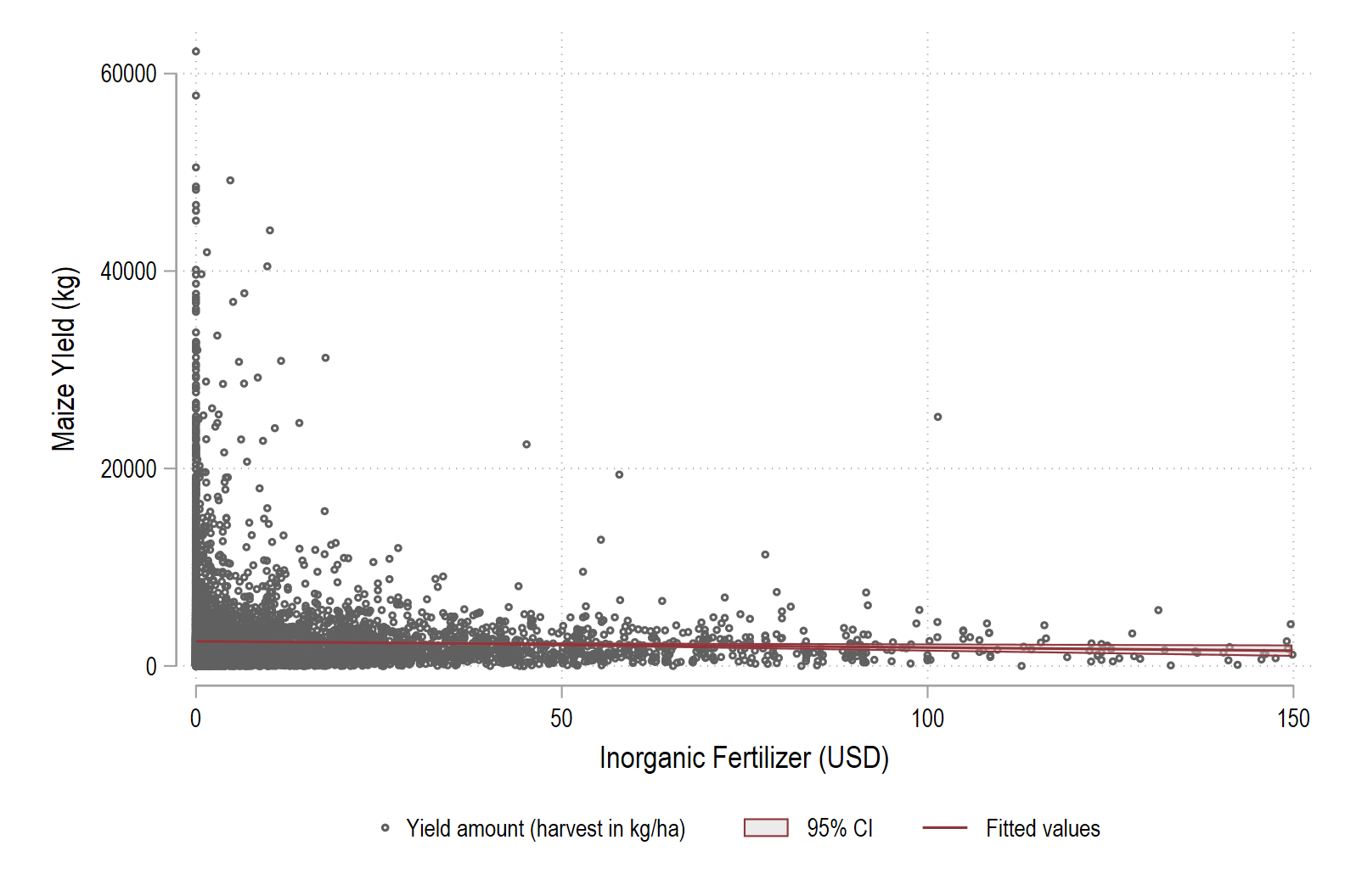
eth_allrounds_finaldata, add a fitted line and confidence interval to a scatter plot, and adjust the appearance.- Make a scatter plot with yield (
yield_kg) on the y-axis and inorganic fertilizer (inorganic_fertilizer_value_USD) on the x-axis, restricting observations to only maize (crop == 3).- Add a fitted line with a confidence band using
lfitciin atwowaygraph. - Place the legend on the bottom (
pos) in three columns (col). - Use very small, hollow circular markers for the points.
- Change the color of the line to
maroonand the pattern of the line to be solid (uselcolorandlpattern). - Make the color of confidence band gray and partially transparent (
gray%50) so the points and line remain visible (usefcolor). - Label the x-axis “Inorganic Fertilizer (USD)” and the y-axis as “Maize Yield (kg)”
- Add a fitted line with a confidence band using
- What is the relationship between yield and fertilizer use? Positive? Negative? No relationship?
- Make a scatter plot with yield (
-
Fitted Lines by Group (10 pts)
Using the
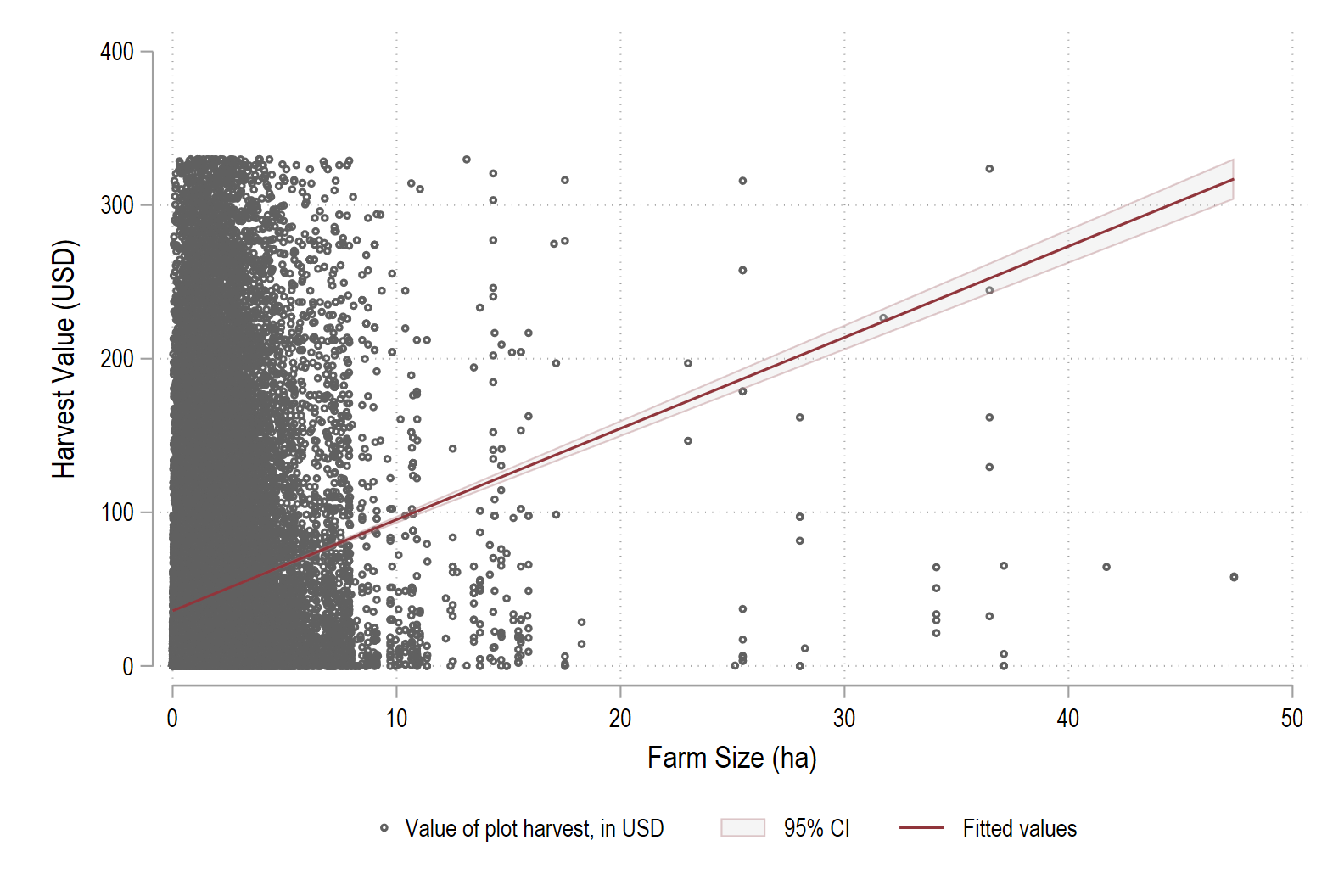
eth_allrounds_finaldata, connect the fitted line on a scatter plot to the underlying regression.1. Create a scatter plot with harvest value (
harvest_value_USD) on the y-axis and farm size (farm_size) on the y-axis.- Add a fitted line with a confidence band using
lfitciin atwowaygraph. - Place the legend on the bottom (
pos) in three columns (col). - Use very small, hollow circular markers for the points.
- Change the color of the line to
maroonand the pattern of the line to be solid. - Make the color of confidence band gray and partially transparent (
gray%50) so the points and line remain visible. - Make the color of the confidence interval lines marron and partially transparent (
maroon%25) so the points and line remain visible (usealcolor). - Label the x-axis “Inorganic Fertilizer (USD)” and the y-axis as “Maize Yield (kg)”
2. Run the corresponding regression:
regress harvest_value_USD farm_size1. What does a one-unit increase in farm size represent?
2. How much does harvest value change, on average, for a one-unit increase in farm size ? 3. Is the relationship between harvest value and farm size statistically significant?3. Now let the relationship differ by whether the household is using traditional seed (
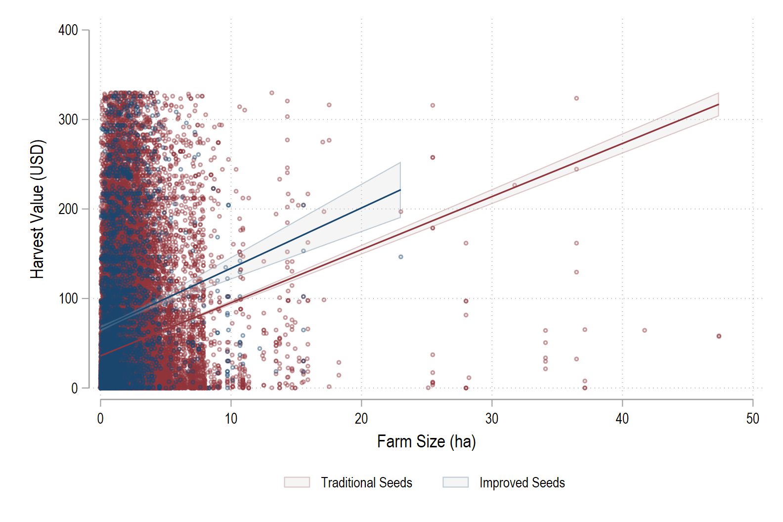
improved == 0) or improved seed (improved == 1). The easiest way to do this is copy the code that makes the graph in problem 1 and then edit it as follows:- Change the scatter plot to display only traditional seed and change the marker color to be
maroon%50. - Add a new scatter plot that displays only improved seed and change the marker color to be
navy%50. - Change the fitted line so that it only fits to observations of traditional seeds.
- Add a new fitted line that fits to observations of improved seed.
- Using
lcolor, change the color of the fitted line so that it matches the color of the corresponding markers (so traditional ismaroonand improved isnavy). - Using
alcolor, change the color and transparency of the confidence interval lines so that the correspond to the markers and are transparent at%25. - Change the legend so it is in two columns. Use
orderto restrict the legend to only printing the third and fifth item in the legend and label them as3 "Traditional Seeds"and5 "Improved Seeds"
4. Run a regression that allows interacts farm size with improved see:
regress harvest_value_USD c.farm_size#i.improved1. How much does harvest value change, on average, for a one-unit increase in farm size when traditional seed is used? 2. How much does harvest value change, on average, for a one-unit increase in farm size when improved seed is used? 3. Are these relationships between harvest value and farm size-seed type statistically significant?
- Add a fitted line with a confidence band using
-
Check That Your Code Runs (20 pts)
Sometimes you think you’re code runs, but it only actually works because of something else you did previously. To make sure it actually runs you should save your work and then run it in a clean environment.
Follow these steps in to make sure your code really runs:
-
Restart Stata by closing the instance of Stata that you have open.
-
When you reopen Stata, type in the command line
clear all. Or, better yet, putclear allat the top of your.dofile, after the preamble but before any commands. -
Rerun your entire homework assignment by clicking the
Executebutton to make sure it runs from start to finish and produces the expected results. -
Make sure that you saved your code with the name of the assignment number (i.e.,
assignment_01). You should see the file in your git repo on your machine. -
Make sure that your code will run on other computers (relevant for all assignments after the first assignment)
- No
cd. Use aproject.dofile instead to set directories - Use only relative paths in files other than the
project.dofile - Use
/not\for paths
- No
-
-
Challenge 5 (10 pts)
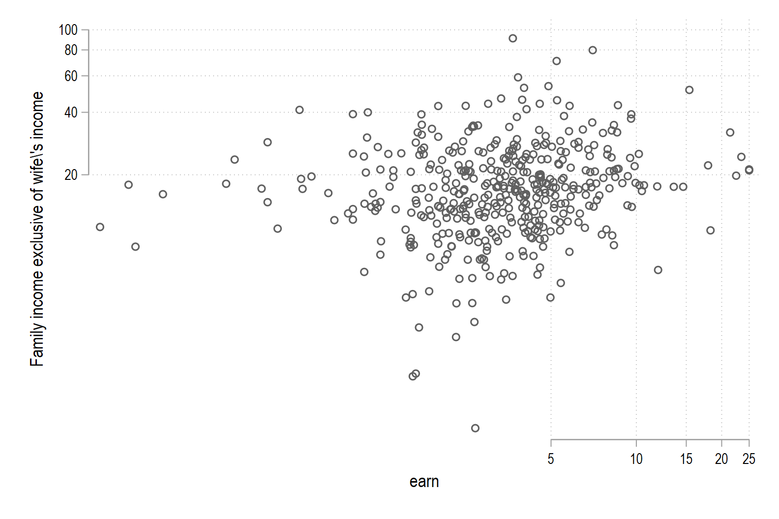
For this challenge we are going to switch up the data and use a data set of women’s labor force participation and earnings from 1975. The data comes from the paper The Sensitivity of an Empirical Model of Married Women’s Hours of Work to Economic and Statistical Assumptions by Thomas A. Mroz.
Download the
Mroz.dtafile from the list of data sets on the course website. Load the data usinguse.We are going to analysis women’s income conditional a number of different variables. Since we want to understand how women’s earnings varies based on these other variables, start by using
keep ifto drop from the data set any woman who does not participate in the labor force.In the data set, women’s earnings have been logged (
lwg). We want the unlogged version so create a new variable calledearnthat is the unloggedlwg. Recall to undo a log we exponentiate the value (exp()) using e. Also, usedrop ifto drop any values of income (inc) that are less than 0.1. Draw a
scatterplot withearnon the x-axis andincon the y-axis. Because of the long tail in data likeincwe want to “normalize” the data a bit by graphing both variables on a log scale. Use the graphing optionyscale(log)andxscale(log).2. Use
tabstatto get mean (stat(mean)) earnings conditional on (by) college attendance (wc). Are average earnings higher if the wife attended college or did not attend college?3. Now, use
egenwithcutto create 10 groups (deciles) based on family incomeinc. Usetabstatto get mean (stat(mean)) earnings conditional on (by) being in one of the 10 deciles (inc_cut). Do women in households that are in the highest decile (group 10) by family income earn the most money?4. Create a new variable called
logincthat is the logged value (log()) of family income (inc).- Make a scatter plot with log family income (
log_inc) on the y-axis and log women’s earnings (lwg) on the x-axis. - Change the marker color to gray and make it 50% transparent (
gray%50). - To this scatter plot at a fitted line using
lfit. - Change the color of this line to
navy, change the pattern tosolidand change the width of the line tothick. - Also add a fitted line using
lowess. This fits a locally weighted non-linear regression line to the data. - Change the color of this line to
maroon, change the pattern tosolidand change the width of the line tothick.
5. Run two regressions (
regress). For the first one, regress the log of women’s earnings on the log of family income. For the second one add college attendance (wc) as a control. Is the unconditional relationship between family income and women’s earnings stronger then that relationship when we condition on college attendance (which regression has the larger co-efficient)?
- Make a scatter plot with log family income (
Assignment submission checklist
Solutions
- Basic Scatter Plots 1, 2
- Grouped Scatter Plots 1, 2, 3,
- Conditional Distributions
- Conditional Means (Discrete)
- Conditional Means (Continuous) 1, 2
- Fitted Lines 1, 2
- Fitted Lines by Group 1, 2, 3
- Check That Your Code Runs
- Challenge 5 1, 2, 3,