Learning Objectives
Following this assignment students should be able to:
- Construct 2x2 and Continuous Two-Way Fixed Effects DiD models
- Visually confirm parallel trends assumption
- Generate relative time dummies and run Event Study regressions
- Visualize dynamic treatment effects via coefficient plots (
coefplot)- Create treatment adoption heatmaps (
heatplot)- Abstract Event Study dummy creation via software packages like
eventdd
Reading
Topics
- How event studies work
- Event study regressions
- Visualizing event studies
- Difference-in-differences
- Parallel trends
- Triple differences
Readings
- Reading (chapter 17): The Effect
- Reading (chapter 18): The Effect
Lecture Notes
Exercises
-
Continuous Treatment DiD (10 pts)
We will use
panel_gis.dtato estimate the effect of STRV seed adoption on crop yields (evi_med) in flooded environments. The data is from Bangaldesh and is at the district level for the whole country. All data except theseeddata is measured using remote sensing and a deep learning algorithm. The data is from Impact evaluations in data-scarce environments: The case of stress-tolerant rice varieties in Bangladesh, which was a former student’s MS thesis.In the data, the treatment metric
seedis uniquely continuous—it captures the combined cumulative availability of the seed in each district (district_id) over time (year).- Regress the yield measure (
evi_med) on the continuous treatment (seed) interacted withyear. Cluster your standard errors at thedistrict_idlevel.- Save the results using
eststocalling itdid1
- Save the results using
- Repeat the regression but this time using
didregress. Cluster your standard errors at thedistrict_idlevel.- Save the results using
eststocalling itdid2
- Save the results using
- Use
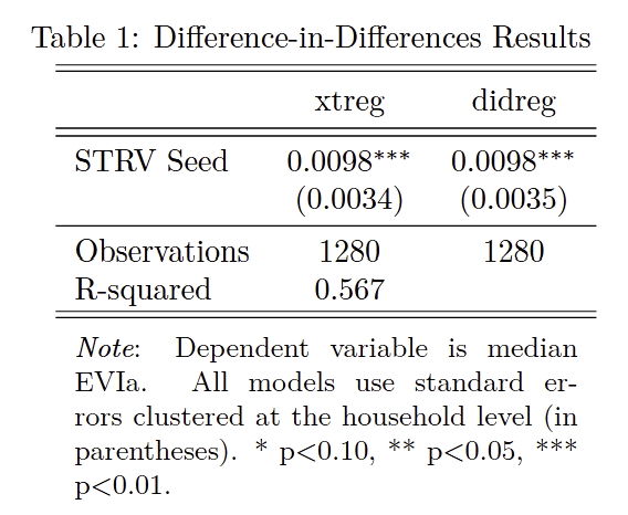
esttabto create a table of results using the following table structure and place the table into Overleaf:
   esttab      did1 did2 using "$answ/12-did.tex", replace ///
                    b(4) se(4) ///
                    rename(seed "STRV Seed") ///
                    keep("STRV Seed") ///
                    star(* 0.10 ** 0.05 *** 0.01) ///
                    stats(N r2, labels("Observations" "R-squared") ///
                    noobs booktabs nonum nomtitle eqlabels(none) ///
                    collabels(none) fmt(0 3))  ///
                    nobaselevels nogaps fragment label ///
                    prehead("\begin{tabular}{l*{2}{c}} " ///
                      "\\[-1.8ex]\hline \hline \\[-1.8ex] " ///
                      "& \multicolumn{1}{c}{xtreg} & " ///
                      "\multicolumn{1}{c}{didreg} \\ \midrule") ///
                    postfoot("\hline \hline \\[-1.8ex] " ///
                      "\multicolumn{3}{p{\linewidth}}{\small " ///
                      "\noindent \textit{Note}: Dependent variable " ///
                      "is median EVI. All models use " ///
                      "standard errors clustered at the " ///
                      "household level (in parentheses). " ///
                      "* p$<$0.10, ** p$<$0.05, *** p$<$0.01.} " ///
                      "\end{tabular}")
- Regress the yield measure (
-
Parallel Trends in Interventions (10 pts)
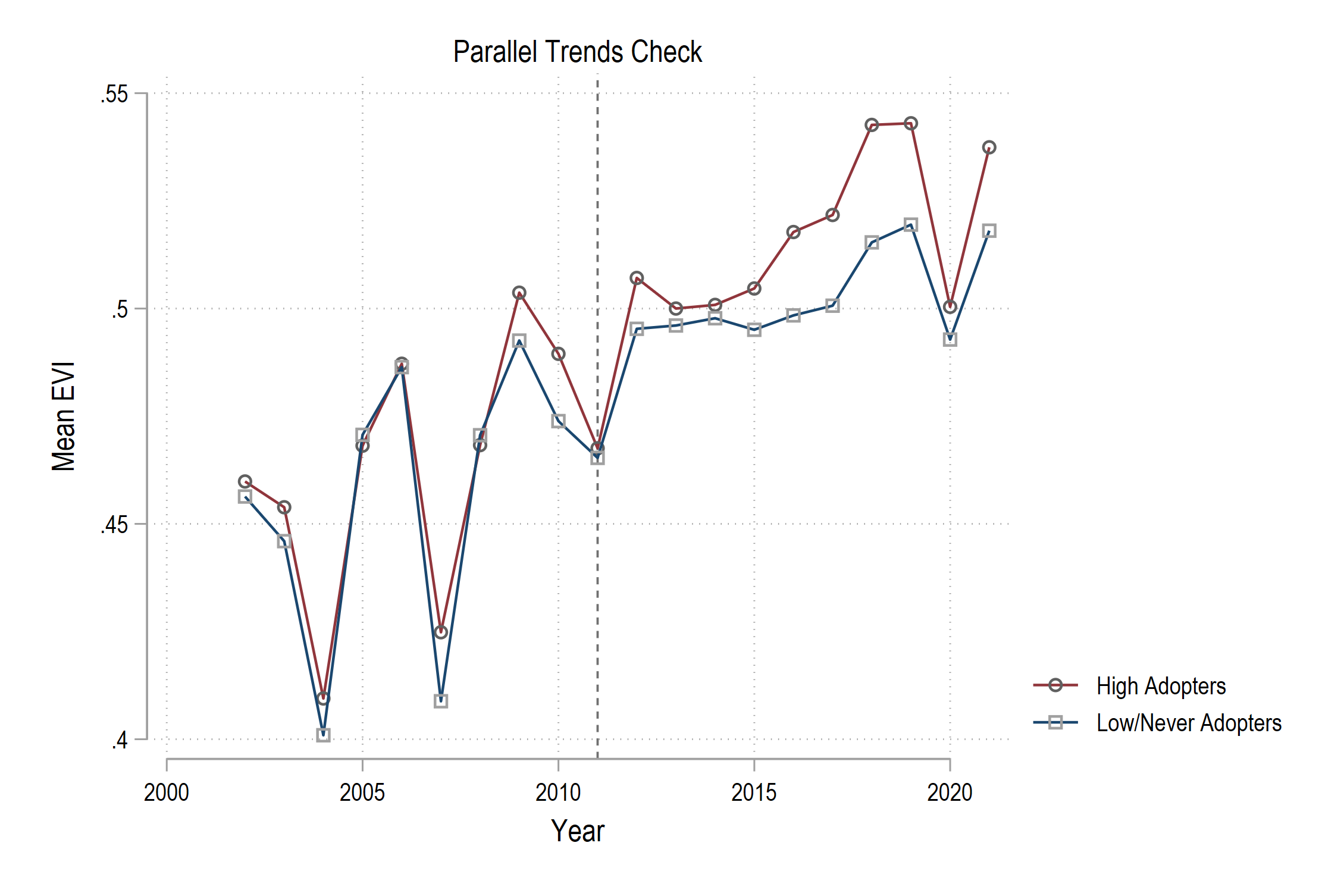
The credibility of a DiD design depends on parallel trends. Even with a continuous policy scaling up, we want to know if places adopting the seed faster were already growing their yield anyway. We can do a basic check by dividing the districts into “Early/High Adopters” vs “Late/Low Adopters”.
- Define “early” or “high” seed adoption districts vs “never/low” adoption.
- Use
bys district_id: egen max_seed = max(seed)to create a variable that captures the maximum level of seed adoption in each district over the entire period. - Use
sum max_seed, detailto get the median value ofmax_seedand thenr(p50)to store it in a local macro. - Use the sorted median value to create a dummy variable equal to
1if the district’smax_seedis greater than the median value ofmax_seed, and0otherwise.
- Use
- Use
collapseto calculate the meanevi_medby year for both theHighAdoptdistricts and the remaining districts. - Plot the trend using
twoway connectedand put anxlineat the year of the first seed introduction (2011).
- Save the figure and input it into your Overleaf document.
- Visually inspect the pre-adoption period. Do the two groups appear to have parallel trends? State your finding in comments.
- Define “early” or “high” seed adoption districts vs “never/low” adoption.
-
Continuous Interacted DiD (10 pts)
The true value of Swarna-Sub1 (the STRV seed) is measured when districts flood. Let’s interact the continuous
seedtreatment with the flood indexc.bin_max_60_611.- Run a regression of
evi_medagainst the interaction of our two continuous variablesc.seed##c.bin_max_60_611using fully specified Two-Way Fixed Effects (i.e.,xtregwith, feandi.year). - Cluster your standard errors at the
district_idlevel. - Save the results using
eststoand call itdid3.
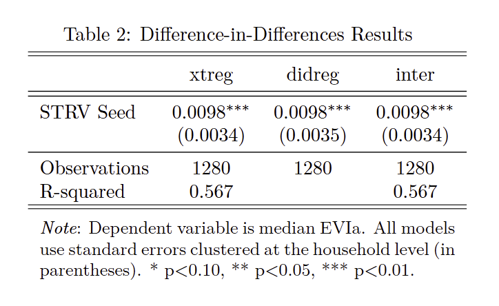
- Adapt the table code from Exercise 1 to add one more column (for
did3) and place the table into Overleaf: - In the relevant section/subsection of your Overleaf file, evaluate the coefficient of the interaction term
c.seed#c.bin_max_60_611. What does a positive or negative sign tell us about how the seed mediates the impact of floods on yield?
- Run a regression of
-
Event Study Regression (10 pts)
In this exercise, you’ll build an event study from scratch using
panel_gis.dta. The goal is to trace out the dynamic effect of STRV seed adoption on crop yields over time, using the interaction-weighted estimator from Sun and Abraham (2021).- Generate a cohort variable that records the first year each district received STRV seed. Create a temporary variable equal to
yearwhenseed > 0, then usebysortandegen min()to createfirst_seedthat pushes the earliest adoption year to all observations within each district. Drop the temporary variable. - Create a relative time variable
ryequal toyearminus the cohort variable. Bin any values greater than 10 to 10 by makingry = 10whenry > 10and also not missing (remember, Stata treats.as infinitely large). - Identify the control cohort. Generate an indicator for districts that never received seed (
never_seed) and a separate indicator for districts that received seed last (in 2019) (last_seed). - Generate lead dummies using a
forvaluesloop counting down from 16 to 2. Name themg_k(e.g.,g_16,g_15, …,g_2), where each equals 1 whenry == -k. Inside the loop, uselabel var g_k "-k"so the variable has a clean name for tables. - Generate lag dummies using a
forvaluesloop from 0 to 10. Name themgk(e.g.,g0,g1, …,g10), where each equals 1 whenry == k. Inside the loop, uselabel var gk "k"so it has a clean name for tables.
1. Run the regression using
xtreg, specifyingevi_medas the outcome, include all lead and lag dummies (g_* g0-g10), add year fixed effects (i.year), specify thefeoption to absorb district fixed effects, and cluster standard errors at thedistrict_idlevel. Store the event study results by prefixing the regression witheststo twfe:.Now run the robust event study using
eventstudyinteract. Specifyevi_medas the outcome, include all lead and lag dummies (g_* g0-g10), set the cohort variable withcohort(first_seed), identify the control cohort withcontrol_cohort(last_seed), includefld_cumlas a covariate withcovariates(), absorb district and year fixed effects withabsorb(i.district_id i.year), and cluster standard errors at thedistrict_idlevel.Because
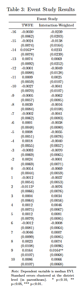
eventstudyinteractstores its estimates internally ine(b_iw)instead ofe(b), commands likeesttabwon’t find them by default. Before exporting, you must move the results usingerepostand store them:* post results for esttab matrix b_iw = e(b_iw) matrix V_iw = e(V_iw) erepost b = b_iw V = V_iw eststo iwExport both stored results to a single LaTeX table using the code block below. Adjust
\scalebox{}to make the table fit in your document.* export results to latex esttab twfe iw using "$answ/12-event-reg.tex", replace /// b(4) se(4) /// drop(*.year _cons) /// star(* 0.10 ** 0.05 *** 0.01) /// mtitles("TWFE" "Interaction-Weighted") /// noobs booktabs nonum /// eqlabels(none) collabels(none) /// nobaselevels nogaps fragment label /// prehead("\begin{tabular}{l*{2}{c}} " /// "\\[-1.8ex]\hline \hline \\[-1.8ex] " /// "& \multicolumn{2}{c}{Event Study} \\ \midrule") /// postfoot("\hline \hline \\[-1.8ex] " /// "\multicolumn{3}{p{\linewidth}}{\small " /// "\noindent \textit{Note}: Dependent variable " /// "is median EVI. Standard errors clustered at the " /// "district level (in parentheses). " /// "* p$<$0.10, ** p$<$0.05, *** p$<$0.01.} " /// "\end{tabular}")2. Looking at the two columns, do you see evidence of bias in the TWFE pre-trend coefficients (the negative lags) compared to the interaction-weighted estimator?
- Generate a cohort variable that records the first year each district received STRV seed. Create a temporary variable equal to
-
Event Plot with `coefplot` (15 pts)
In this exercise, you’ll graph the results of the event study you estimated in the previous exercise so we can visualize the dynamic effect of STRV seed adoption on crop yields over time.
- You already estimated the robust event study in the previous exercise using
eventstudyinteract. Re-run that exacteventstudyinteractcommand (without theerepostpart) to ensure the model results are fresh in Stata’s memory. - Extract the interaction-weighted coefficients into a matrix: use
matrix C = e(b_iw)to grab the point estimates from the stored results. - The variance-covariance matrix
e(V_iw)contains the variances on its diagonal. To get standard errors, you need the square root of those diagonal elements. Usematato do this in one line:mata st_matrix( "A", sqrt( diagonal( st_matrix ("e(V_iw)") ) ) ). - Stack the standard errors below the coefficients:
matrix C = C \ A'. The backslash (\) stacks matrices vertically, andA'transposesAfrom a column vector to a row vector so it aligns withC. Now row 1 ofCis the coefficients and row 2 is the standard errors. - Print the matrix to verify:
matrix list C. You should see one row of point estimates and one row of standard errors, with columns named after your lead and lag dummies.
1. How many columns does your matrix
Chave? Does this match the number of lead and lag dummies you created?2.Now use
coefplotto plot directly from the matrixC. Build the plot with the following options:- Source the coefficients from row 1 of
Cusingmatrix(C[1])and pair them with standard errors from row 2 usingse(C[2]). - Set the graph region background to white with
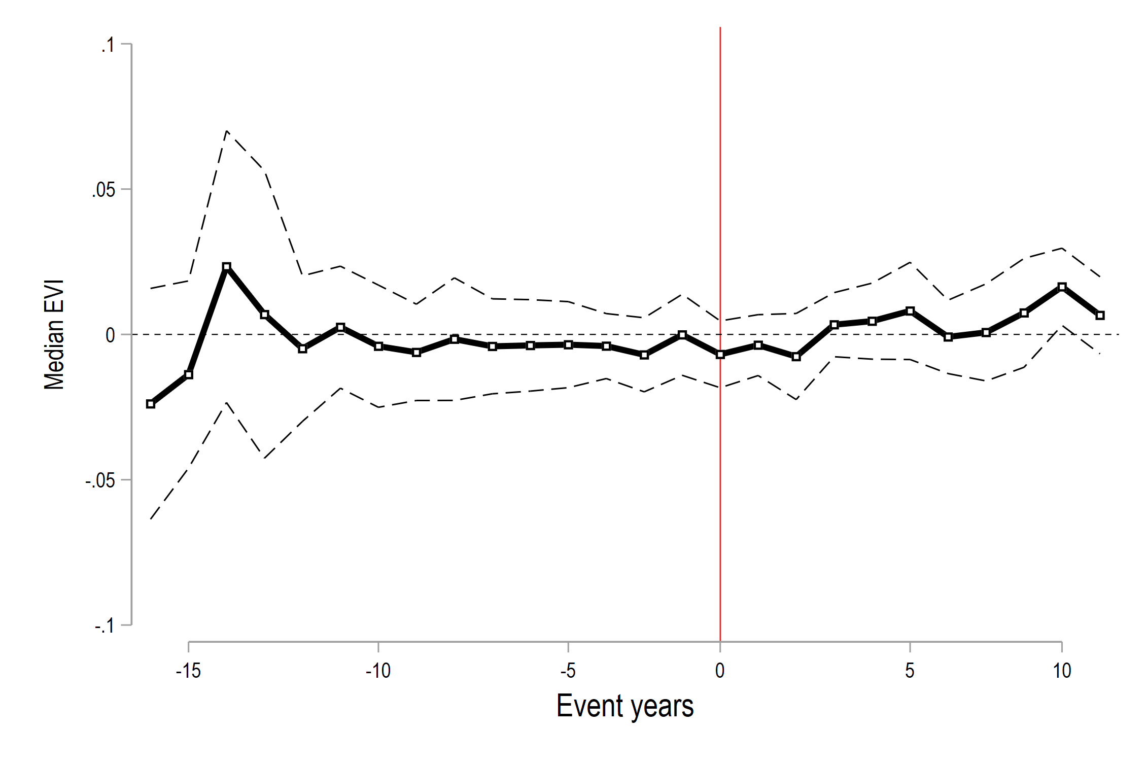
graphregion(fcolor(white)). - Label the x-axis “Event years” using
xtitle()withsize(medlarge). - Orient the plot vertically and include the omitted period as a zero with the
verticalandomittedoptions. - Use square markers (
msymbol(s)), colored black (mc(black)) with white fill (mfcolor(white)). - Add a horizontal reference line at zero using
yline(0)with thin black styling. - Connect the points with thick black lines using
recast(connected),lw(thick), andlc(black). - Display the confidence intervals as dashed lines using
ciopts(recast(rline) lw(thin) lc(black) lp(dash)). - Add a vertical treatment reference line at position 16 (where
g_1would be — the last pre-treatment period) usingxline()in red. - Suppress the grid with
ylabel(, angle(0) nogrid)and keep only the lead/lag coefficients withkeep(g_* g*). - Clean up the coefficient labels using
rename(g_* = "-" g* = "")so leads show as negative numbers and lags as positive. - Set the y-axis title to “Median EVI” and manually label the x-axis tick marks at informative intervals (e.g., positions 02, 07, 12, 16, 21, 25 labeled as “-15”, “-10”, “-5”, “0”, “5”, “10”).
- Export the plot and import it into your Overleaf file.
3. Do the pre-treatment coefficients hover near zero, consistent with parallel trends? After adoption, does the effect of STRV seed on
evi_medappear to grow over time, or is it immediate and constant?
- You already estimated the robust event study in the previous exercise using
-
Treatment Adoption Heatmap (20 pts)
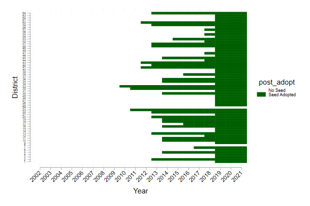
In lecture we visualized the Castle Doctrine’s staggered rollout with a heatmap. Now create one for STRV seed adoption in
panel_gis.dta.- Create the binary treatment indicator
post_adoptfrom thefirst_seedvariable you built in Exercise 4:gen post_adopt = (year >= first_seed) & (first_seed != .). - Use
heatplotto create a treatment adoption heatmap with districts on the y-axis and years on the x-axis:heatplot post_adopt i.district_id i.year, /// colors(white dkgreen) /// ylabel(, labsize(tiny) angle(0)) /// xlabel(, labsize(small) angle(45)) /// ytitle("District") xtitle("Year") /// legend(order(1 "No Seed" 2 "Seed Adopted")) /// graphregion(color(white)) - Export the heatmap as a
.pngand input it into your Overleaf document.
- Create the binary treatment indicator
-
Using the `eventdd` Package (20 pts)
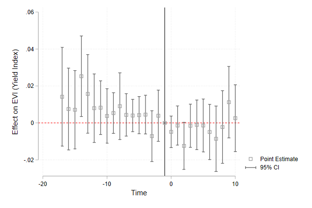
Manual dummy-shifting and binning works but is inherently repetitive across projects. Dedicated Stata packages such as
eventddabstract the dummy management away.- Run the
eventddcommand using theryvariable you created in Exercise 4. - Include
c.bin_max_60_611 i.yearas the independent variables. - Use the
method()option to control for unit and time fixed effects and cluster standard errors bydistrict_id. - Use the
graph_op()option to set the y-axis title. - Upload the resulting plot to your Overleaf document.
- Run the
-
Check That Your Code Runs (5 pts)
Sometimes you think you’re code runs, but it only actually works because of something else you did previously. To make sure it actually runs you should save your work and then run it in a clean environment.
Follow these steps in to make sure your code really runs:
-
Restart Stata by closing the instance of Stata that you have open.
-
When you reopen Stata, type in the command line
clear all. Or, better yet, putclear allat the top of your.dofile, after the preamble but before any commands. -
Rerun your entire homework assignment by clicking the
Executebutton to make sure it runs from start to finish and produces the expected results. -
Make sure that you saved your code with the name of the assignment number (i.e.,
assignment_01). You should see the file in your git repo on your machine. -
Make sure that your code will run on other computers (relevant for all assignments after the first assignment)
- No
cd. Use aproject.dofile instead to set directories - Use only relative paths in files other than the
project.dofile - Use
/not\for paths
- No
-
-
Challenge 12 (Challenge - 20 pts)
This challenge combines Difference-in-Differences with a Monte Carlo (MC) simulation and ridgeline plots to explore how measurement error attenuates regression estimates. The data is also from the Impact evaluations in data-scarce environments paper though it is a different dataset. By the end of the exercise you will have replicated Figure 2 in that paper. First, you will estimate a baseline model, add simulated noise to a continuous variable, and visualize the loss of statistical significance using
joyplot.Part 1 — Baseline Regression and Coefplot
- Download the
mc_data.dtadataset from the course webpage and then load it into Stata. - Regress yield on:
- the indicator variables for if the rice variety is swarna-sub1, is another modern variety, and is a traditional variety,
- the interactions between the three variety indicators and the flood indicators,
- the indicator for if the flood was greater than 12 days and that variable interacted with if the variety is swarna-sub1,
- fixed effects for group(block),
- and cluster standard errors at the village level.
- Store the results using
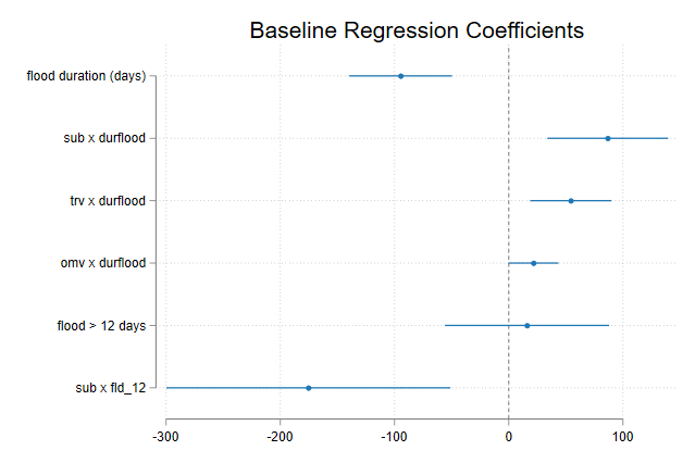
eststo baseline. - Use
coefplotto visualize the coefficients. Keep only the flood variables and the flood-variety interaction terms. Format the plot cleanly, include a vertical reference line at $0$, export it, and import it into your Overleaf document.
Part 2 — Monte Carlo Simulation (Measurement Error)
Now, we will test how robust the
subfldcoefficient is if we assume the continuous outcome variable (yield) is measured with error. To do this, we are going to use Stata’s custom program function. We will write a program that adds normally distributed noise toyieldand then runs the same regression as in Part 12.1. We will then loop through different levels of noise and store the results. We’ve not dealt with programs before but it is covered in a lecture in week 6. [Note that the entire Monte Carlo simulation takes about 20 minutes to run on my machine.]- Start by ensuring no other program is running using
capture program drop yld_reg. - Set up a
programcalledyld_regthat is anrclassprogram. Close the program usingend. - Within the program (between
programandend)- Create an argument (
args) that accepts a noise parameternp. - Calculate the mean and standard deviation of
yieldusingsumand save these as locals calledy_meanandy_sd. Multiply these bynpto get the error mean and standard deviation. Save these asl locals calledymmandysd. - Replace
yieldwithyieldplus some random noise that is normally distributed (rnormal()) with mean 0 and standard deviationysd. - Replace
yieldagain but this time setyield = 0ifyieldis less than 0. This is to ensure values of yield do not fall below 0. - Return a scalar called
meanthat is the mean ofyield. - Run the exact same baseline regression from Part 12.1.
- Create an argument (
- Now we will run the Monte Carlo simulation using a single loop. This goes after you’ve used
endto close the program.- Start by clearing memory and creating an empty temporary file (
building) to collect our results in. - The simulation will loop through noise levels from 0% to 10% by increments of 1%. Within the loop:
- Convert your loop index to a percentage (
local i = j/100). - Load the raw dataset (
use "$data/mc_data", clear) sosimulatebegins with a fresh copy of the data. - The
simulatecommand acts as an inner loop. It will run theyld_regprogram 5,000 times for the current noise level (reps(5000)), capturing the coefficients (_b), standard errors (_se), degrees of freedom (dfr), and returned mean (mean). - Because we purposefully don’t supply a
saving()option,simulatewill just overwrite our memory with a database of its 5,000 runs! We simply mark these specific results with our current noise parameter (gen noise =i’), append them into our emptybuildingtempfile, and save overbuilding` with the newly augmented list.
- Convert your loop index to a percentage (
- Start by clearing memory and creating an empty temporary file (
* prepare an empty file for results clear tempfile building save `building', emptyok * run mc simulations set seed 5762 forvalues j = 0/10 { local i = `j'/100 * load data and run simulation for current noise level use "$data/mc_data.dta", clear simulate _b _se dfr=(e(df_r)) mean=r(mean), /// reps(5000): yld_reg `i' * add noise indicator and append to master results file gen noise = `i' append using `building' save `"`building'"', replace }- Now that we have a data set of all the results, let’s clean it up a bit.
- Rename
_eq2_dfrasdfrand rename_eq2_meanasmean. - Create a variable (
t_subfld) that holds the t-statistic for thesubfldcoefficient, calculated as_b_subfld / _se_subfld. - Create a variable (
p_subfld) that holds the two-tailed p-value for thesubfldcoefficient, calculated as2 * ttail(dfr, abs(t_subfld)). - Create a variable (
sig) that is equal to 1 ifp_subfldis less than or equal to 0.05, is 0 otherwise, and is missing whenp_subfldis missing. - To help with the visuals in the graphic, replace
noisewith 100 times itself. - Use the following loop to label the
noisevariable:
* label stuff for graph
	capture label drop noise
	forvalues i = 0/10 {
		if `i' < 10 {
        label define noise `i' "0.0`i'{&sigma}", add
		}
    else {
        label define noise `i' "0.`i'{&sigma}", add
		}
	}
	label values	noise noise
How many regressions did we just run in total?
Part 3 — Visualize P-Value Attenuation
- Use
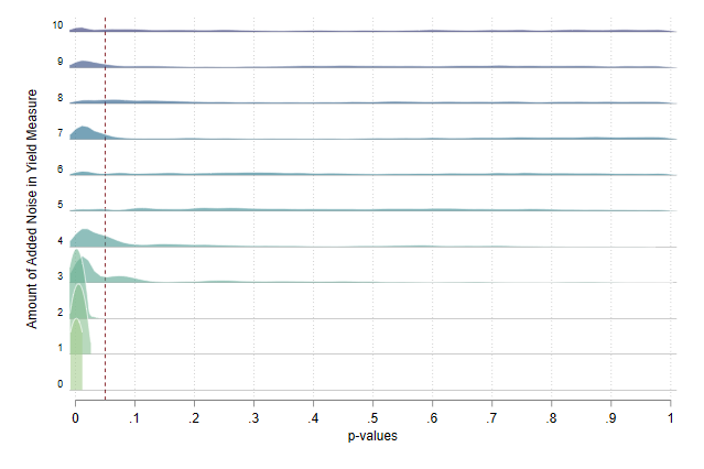
joyplotto visualize the distribution ofp_subfldgrouped by thenoiselevel. Include the following options to match the example plot exactly:- Add horizontal lines for each group using
yline. - Set the kernel density bandwidth to 0.01 using
bwid()and normalize the density curves so each group has equal height usingnorm(local). - Scale the density curves nicely using
rescaleand allow the density curves to overlap vertically up to 2 times usingoverlap(). - Set the transparency (alpha) of the curves to 60% using
alpha(). - Set the x-axis labels from 0 to 1 in increments of 0.1 using
xlabel(). - Set the x-axis title to “p-values” using
xtitle(). - Use the ‘crest’ color palette using
palette(). - Set the y-axis title to “Amount of Added Noise in Yield Measure” and add a right margin (
margin(r=4)) after the title but within theytitle()option. - Add a vertical line at 0.05 (
xline(0.05, lcolor(maroon))) so that we can see what portion of the distribution falls outside significance. - Use the
white_tableauscheme or similar to format the plot nicely.
- Add horizontal lines for each group using
- Export your ridgeline plot and import it into your Overleaf document.
Looking at your final ridgeline plot, as the amount of added noise to the yield measure increases, what happens to the distribution of p-values? At approximately what percentage of added noise do we entirely lose statistical significance at the 5% level?
- Download the
Assignment submission checklist
Solutions
- Continuous Treatment DiD
- Parallel Trends in Interventions
- Continuous Interacted DiD 1, 2
- Event Study Regression 1, 2
- Event Plot with
coefplot1, 2 - Treatment Adoption Heatmap
- Using the
eventddPackage - Check That Your Code Runs
- Challenge 12 1, 2, 3